The following graph shows the market demand for wheat. PRICE (Cents per bushel) 1. Use the orange points (square symbol) to plot the short-run industry supply curve for the wheat industry. Specifically, place an orange point at the lowest point of the supply curve and another orange point at the highest point of the supply curve. (Hint: You can disregard the portion of the supply curve that corresponds to prices where there is no output, since this is the industry supply curve. Plot your points in the order in which you would like them connected. Line segments will connect the points automatically.) 2. Place the black point (plus symbol) on the graph to indicate the short-run equilibrium price and quantity in this market. (Note: Dashed drop lines will automatically extend to both axes.) 1Demand 90 80 70 60 50 40 30 20 10 0 0 400 800 1200 1600 2000 2400 2800 3200 3600 4000 QUANTITY (Thousands of bushels) At the current short-run market price, firms will given the current market price. Supply Curve Equilibrium ? in the short run. In the long run, the market
The following graph shows the market demand for wheat. PRICE (Cents per bushel) 1. Use the orange points (square symbol) to plot the short-run industry supply curve for the wheat industry. Specifically, place an orange point at the lowest point of the supply curve and another orange point at the highest point of the supply curve. (Hint: You can disregard the portion of the supply curve that corresponds to prices where there is no output, since this is the industry supply curve. Plot your points in the order in which you would like them connected. Line segments will connect the points automatically.) 2. Place the black point (plus symbol) on the graph to indicate the short-run equilibrium price and quantity in this market. (Note: Dashed drop lines will automatically extend to both axes.) 1Demand 90 80 70 60 50 40 30 20 10 0 0 400 800 1200 1600 2000 2400 2800 3200 3600 4000 QUANTITY (Thousands of bushels) At the current short-run market price, firms will given the current market price. Supply Curve Equilibrium ? in the short run. In the long run, the market

Principles of Economics 2e
2nd Edition
ISBN:9781947172364
Author:Steven A. Greenlaw; David Shapiro
Publisher:Steven A. Greenlaw; David Shapiro
Chapter8: Perfect Competition
Section: Chapter Questions
Problem 7SCQ: If new technology in a perfectly competitive market brings about a substantial reduction in costs of...

Related questions
Question
100%
PLease show all steps clearly and please make the graph very clear so that i know in which numbers i have to draw the lines on so please write down each of the point in the line segments. Thank U!
Note:-
- Do not provide handwritten solution. Maintain accuracy and quality in your answer. Take care of plagiarism.
- Answer completely.
- You will get up vote for sure.
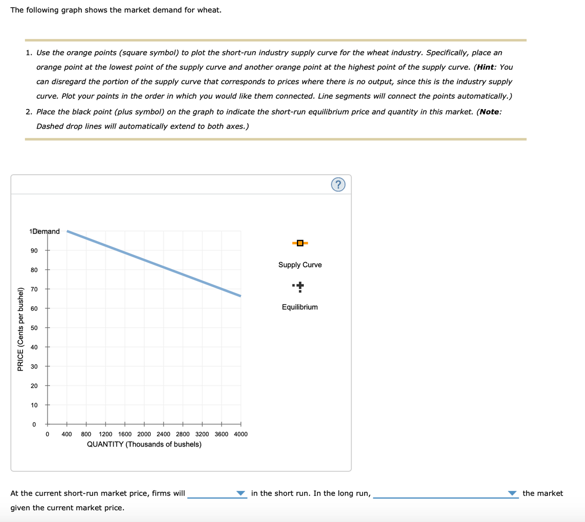
Transcribed Image Text:The following graph shows the market demand for wheat.
PRICE (Cents per bushel)
1. Use the orange points (square symbol) to plot the short-run industry supply curve for the wheat industry. Specifically, place an
orange point at the lowest point of the supply curve and another orange point at the highest point of the supply curve. (Hint: You
can disregard the portion of the supply curve that corresponds to prices where there is no output, since this is the industry supply
curve. Plot your points in the order in which you would like them connected. Line segments will connect the points automatically.)
2. Place the black point (plus symbol) on the graph to indicate the short-run equilibrium price and quantity in this market. (Note:
Dashed drop lines will automatically extend to both axes.)
1Demand
90
80
70
60
50
40
30
20
10
0
0
400
800 1200 1600 2000 2400 2800 3200 3600 4000
QUANTITY (Thousands of bushels)
At the current short-run market price, firms will
given the current market price.
Supply Curve
+
Equilibrium
?
in the short run. In the long run,
the market
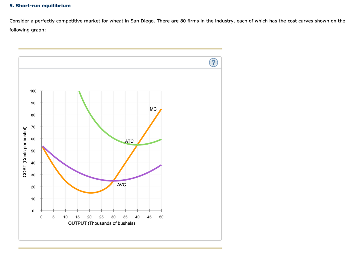
Transcribed Image Text:5. Short-run equilibrium
Consider a perfectly competitive market for wheat in San Diego. There are 80 firms in the industry, each of which has the cost curves shown on the
following graph:
COST (Cents per bushel)
100
90
80
70
60
50
40
30
20
10
0
0
5
ATC
AVC
10 15 20 25 30 35
OUTPUT (Thousands of bushels)
40
MC
45 50
Expert Solution
This question has been solved!
Explore an expertly crafted, step-by-step solution for a thorough understanding of key concepts.

This is a popular solution!

Trending now
This is a popular solution!

Step by step
Solved in 4 steps with 2 images

Knowledge Booster


Learn more about
Need a deep-dive on the concept behind this application? Look no further. Learn more about this topic, economics and related others by exploring similar questions and additional content below.Recommended textbooks for you
Principles of Economics 2e
Economics
ISBN:
9781947172364
Author:
Steven A. Greenlaw; David Shapiro
Publisher:
OpenStax
Essentials of Economics (MindTap Course List)
Economics
ISBN:
9781337091992
Author:
N. Gregory Mankiw
Publisher:
Cengage Learning
Principles of Economics, 7th Edition (MindTap Cou…
Economics
ISBN:
9781285165875
Author:
N. Gregory Mankiw
Publisher:
Cengage Learning

Principles of Economics (MindTap Course List)
Economics
ISBN:
9781305585126
Author:
N. Gregory Mankiw
Publisher:
Cengage Learning
Principles of Microeconomics
Economics
ISBN:
9781305156050
Author:
N. Gregory Mankiw
Publisher:
Cengage Learning

Principles of Microeconomics (MindTap Course List)
Economics
ISBN:
9781305971493
Author:
N. Gregory Mankiw
Publisher:
Cengage Learning